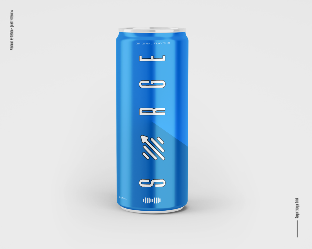
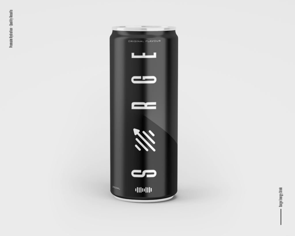
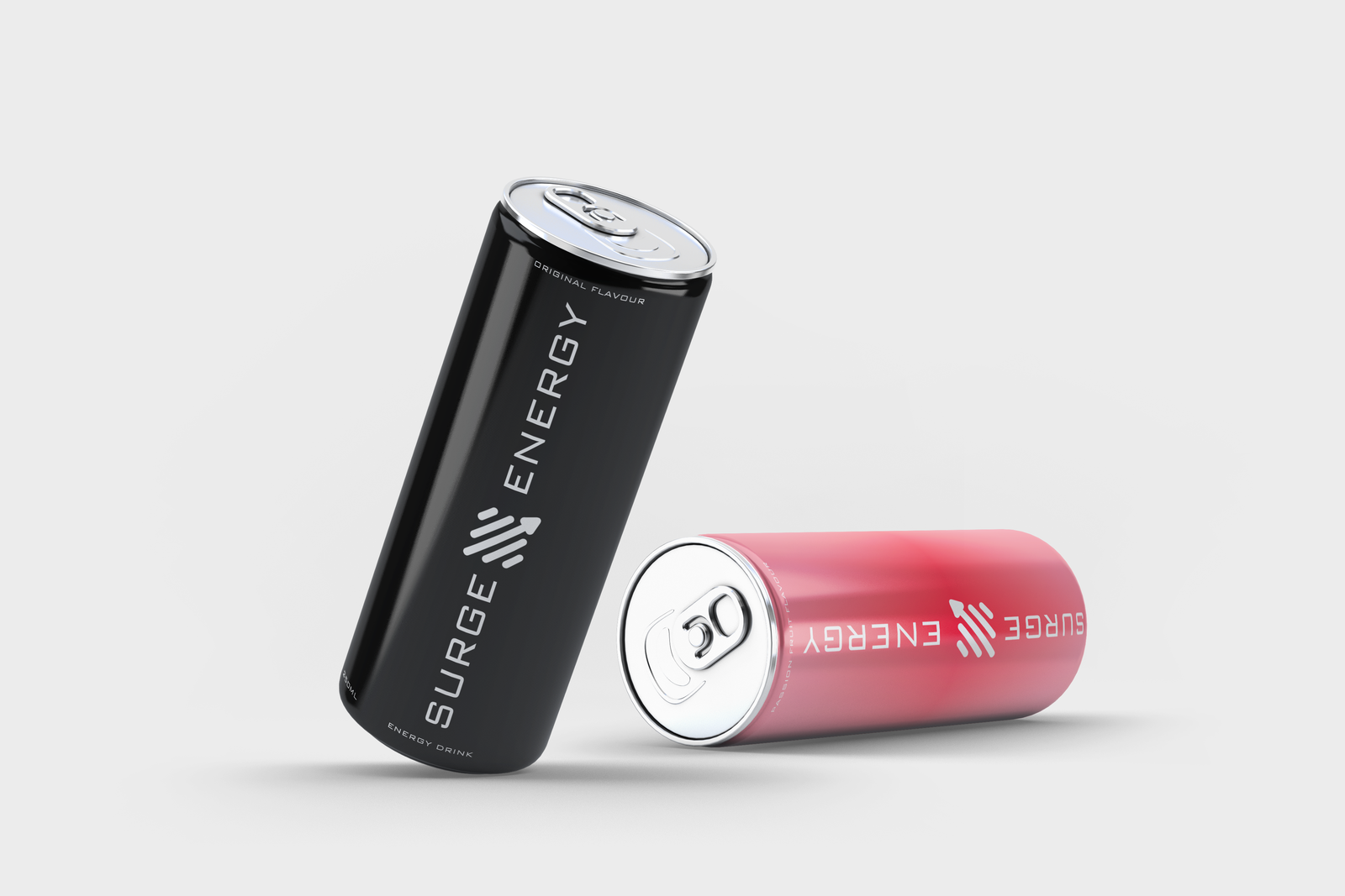
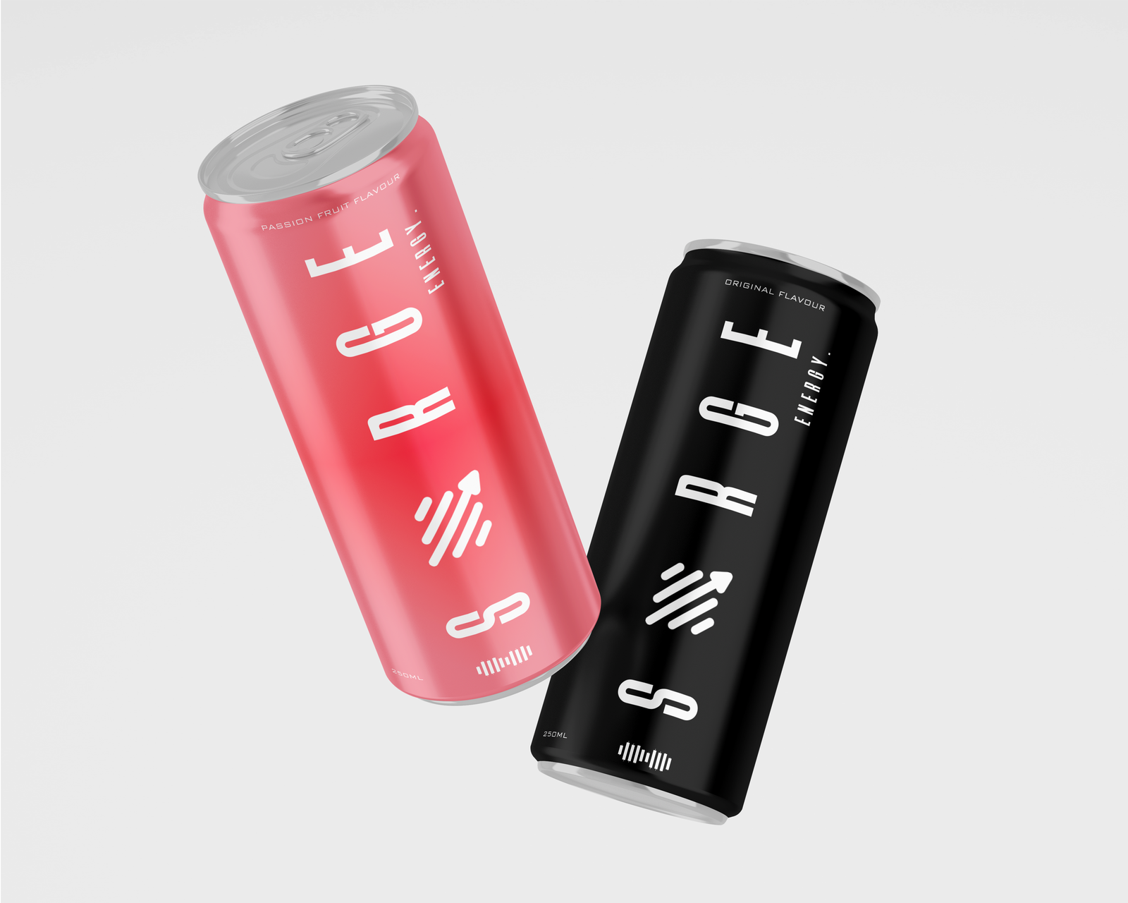
Color Palette: The primary colors will include deep blue and coal black, symbolizing stability and growth, complemented by vibrant accents of orange or red to convey energy and excitement. This color scheme not only aligns with the financial theme but also captures the attention of consumers looking for a refreshing boost.
Logo Design: The logo will feature a stylized candlestick chart, where the candlesticks are simplified to their essential forms. This minimalist representation will be paired with the brand name “Surge Energy” in a sleek, modern typeface. The logo will be versatile enough to be used across various platforms, from cans to marketing materials.
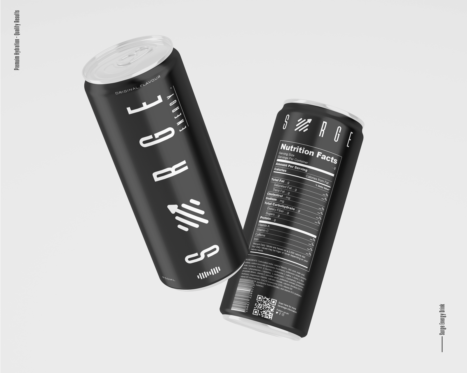
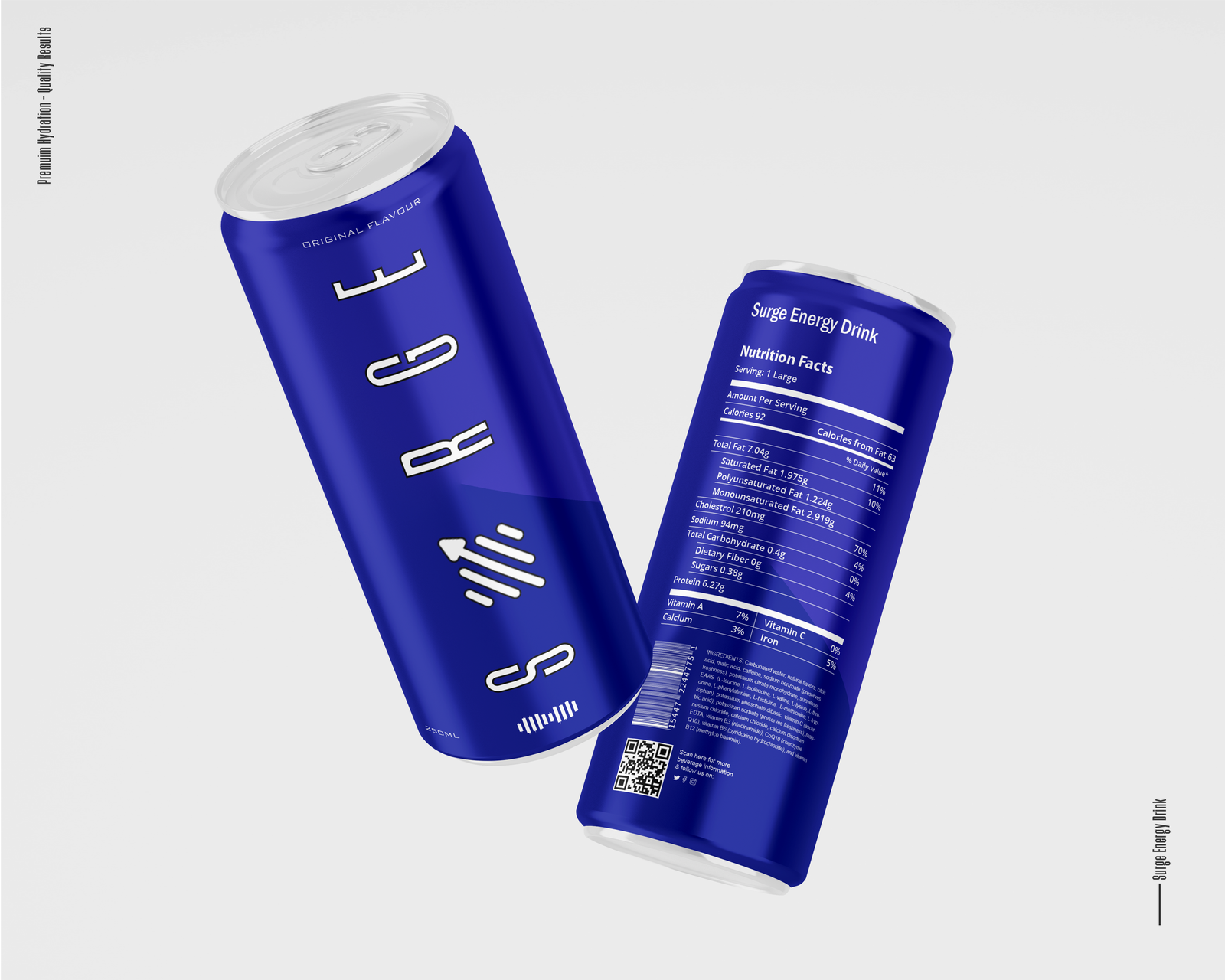
Packaging: The energy drink cans will adopt a minimalist design, focusing on clean lines and ample white space to avoid clutter. The use of metallic finishes will enhance the premium feel, while the candlestick graphics will be subtly integrated into the background or as part of the can’s texture. Information such as flavor and nutritional benefits will be presented in a straightforward manner, ensuring that consumers can quickly identify the product’s offerings.
Regular Medium SemiBold Blod
This Is Text Message Medium Typography Just Amazing Awesome
For those of us who are blessed with good sight. So we seldom consider it. That’s why going off to investigate the whys and hows involved is a little like trying to get behind the wind