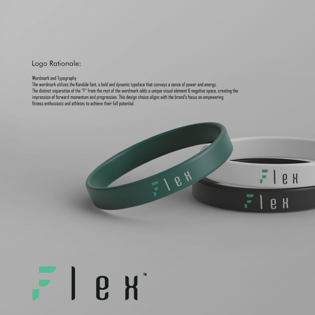
The wordmark utilizes the Kandide font, a bold and dynamic typeface that conveys a sense of power and energy. The distinct separation of the “F” from the rest of the wordmark adds a unique visual element, creating the impression of forward momentum and progression. This design choice aligns with the brand’s focus on empowering fitness enthusiasts and athletes to achieve their full potential.
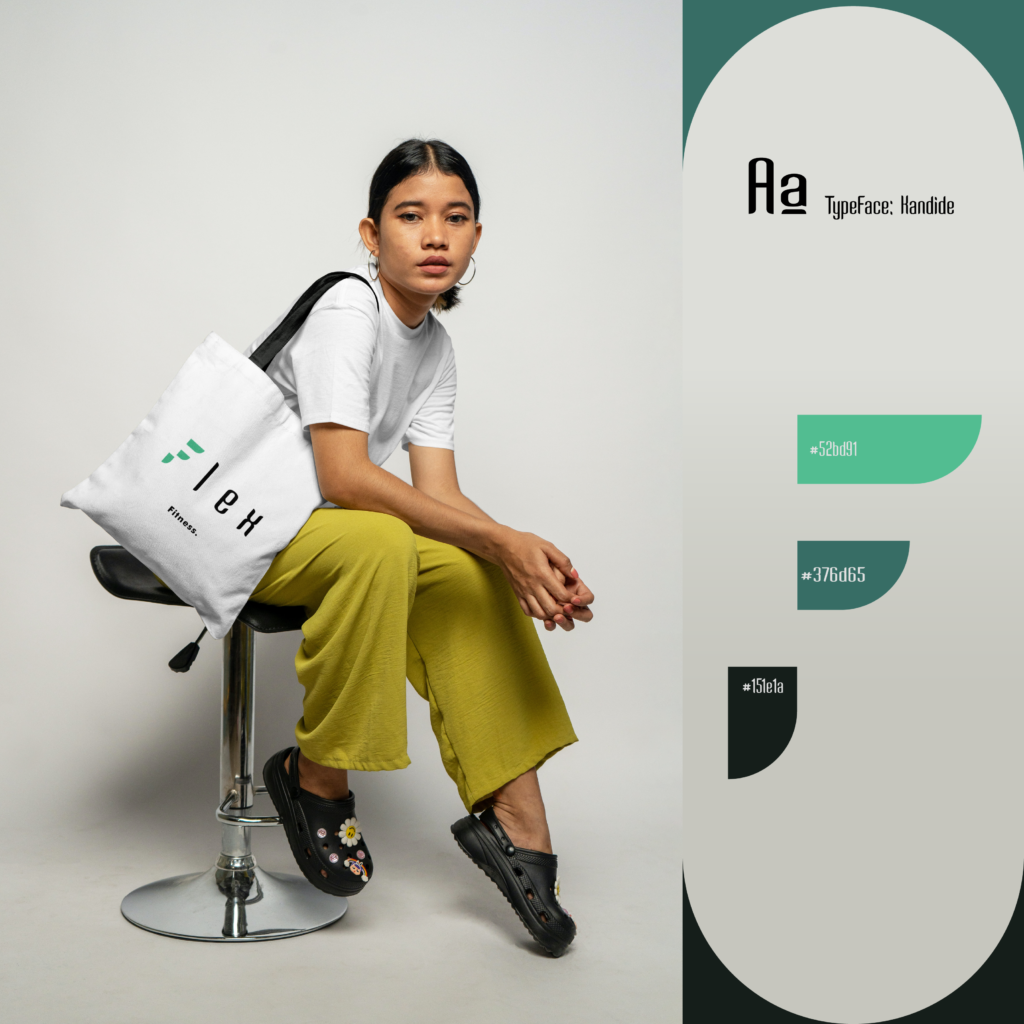
The combination of the deep charcoal base, the energetic teal accent, and the bright green complement creates a bold, dynamic, and visually striking color palette. This palette effectively communicates the brand’s core values of strength, performance, and a relentless drive to push the boundaries of athletic achievement.